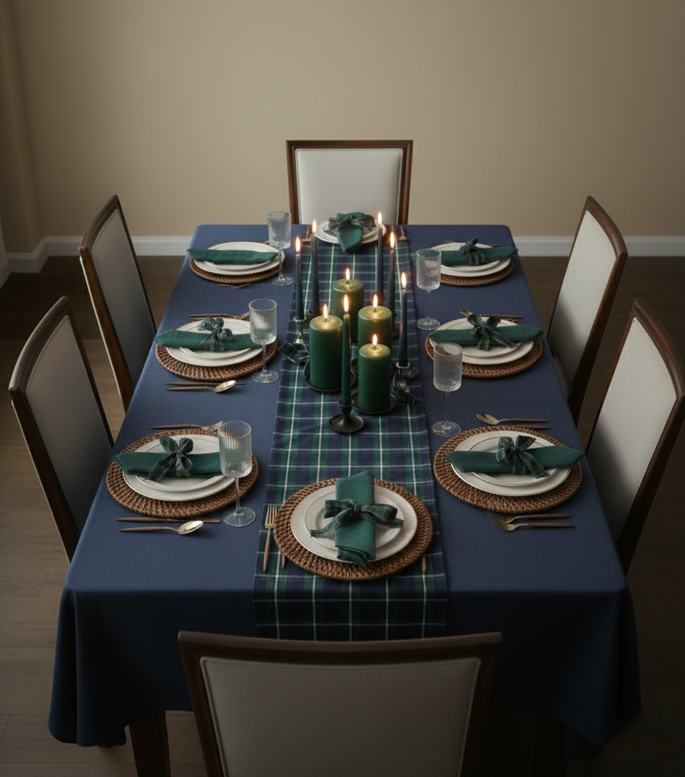
Tartan
The linear pattern of the runner creates a strong directional line, balanced by the radial symmetry of the place settings. Utilizing a split-complementary color scheme, the deep blues of the tablecloth and greens in the plaid are punctuated by the warm browns of the chargers and cutlery, creating visual interest and depth.
Shop This Look
Tartan plaid table runner
Paid LinkI needed a grounding element. Its linear pattern creates a strong directional line across the tablescape, balancing all the radial symmetry.
Green Cloth Dinner Napkins
Paid LinkI chose these napkins to echo the runner's greens, pulling everything together for a cohesive, tailored feel. It's all in the details!
Navy Blue Weaved Tablecloth
Paid LinkI needed a solid, grounding color to balance the energy of the tartan runner. The navy's depth anchors the whole tablescape beautifully.
Tartan Ribbon
Paid LinkI chose a tartan ribbon to tie the napkins as a mini echo of the table runner. It's subtle, but it brings the whole look together.
Round Rattan Chargers
Paid LinkI chose the woven charger to add warmth and texture. The dark color is key; it complements the blue and green without competing.
Green Pillar Candles
Paid LinkI chose these pillar candles to enhance the classic palette. The varying heights add dimension and drama to the table!
Dark Blue Taper Candles
Paid LinkI wanted to echo the tablecloth's rich tone, so I chose these dark blue tapers. Their height adds a touch of drama to the tabletop.
Ribbed Wine Glasses
Paid LinkI chose this glassware for its subtle texture that plays off the smooth linens. Plus, its simple shape doesn't compete with the tartan.
Ivory Plastic Plates
Paid LinkI love how the ivory plays against the rich blues and greens. It's a clean, classic counterpoint to the bold tartan.
Gold Disposable Cutlery with Wood Grain Handle
Paid LinkI chose this flatware for its warm wood tones that add a touch of rustic charm. They're a lovely contrast to the cool blues and greens!
Black Candlestick Holders
Paid LinkI chose these dark candlesticks to punctuate the softer hues. Their height draws the eye up, balancing the horizontal lines of the runner.